- DATE:
- AUTHOR:
- Grant Wensley

Series selection for metrics in dashboards
DATE:
AUTHOR:
Grant Wensley
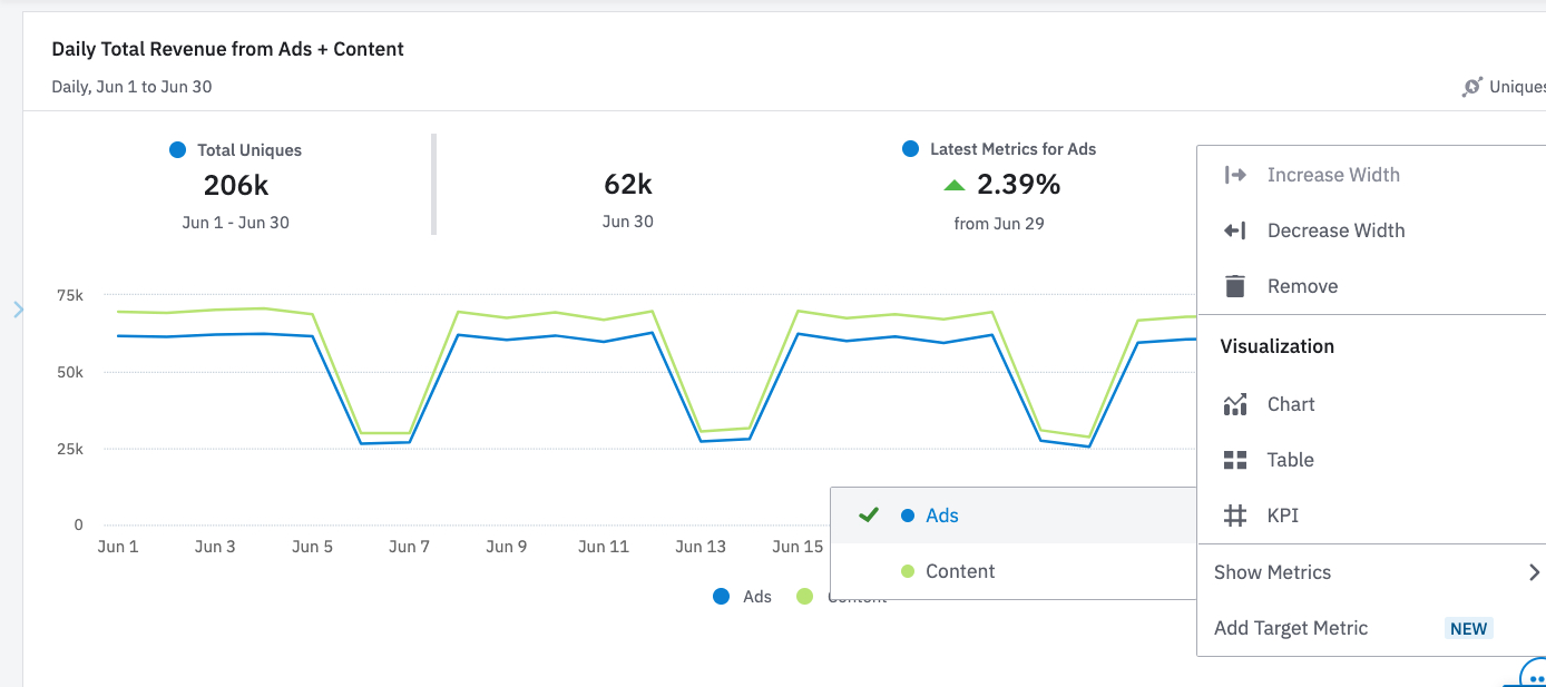
You can now view metrics for charts with multiple series on dashboards, and toggle which series to visualize. We’ve also added descriptive labels along with matching series colors to make it easier to understand the metrics you’re viewing. This is available for event segmentation, sessions and revenue charts on saved dashboards. This can be set up by clicking the options icon on a chart saved to a dashboard, and clicking “Show Metrics.”